votevote.page is live
-
@culi Was just playing around with it and a bit confused on one thing: FPTP and Veto seem to produce almost exactly opposite results. I understand that the methods are opposite in a sense, but that shouldn't mean that the most common first choice in one is going to be the most common last choice in the other. I suspect that you are tallying them wrong.
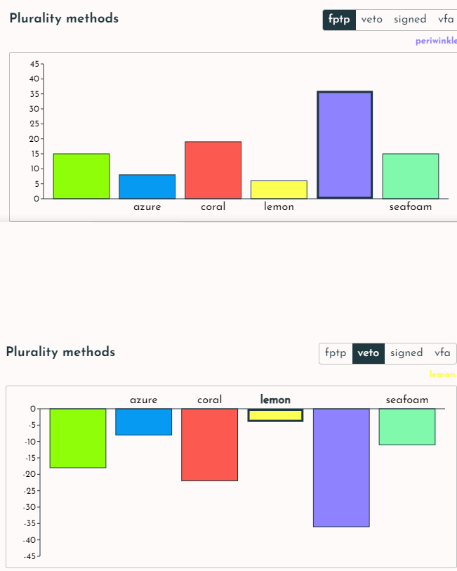
The same issue applies to VFA (for and against). Candidates that get lots of positive votes seem to also get a similar number of negative votes. That seems unlikely.
Regarding colors: I think you should stick with RGB rather than mixing HLS into your distance formular. RGB treats it spacially, so a middle gray candidate should approximate the median (right in the center of the RGB cube). I'd think that's what you'd want. HLS is weird in that hue is cyclical, and it is going to see colors like gray with a slight tinge of yellow and gray with a slight tinge of blue as being pretty far apart, since their hues are so different (even if they are very close to each other in any color space), while pure yellow and pure blue are going to be very close in saturation even though they are polar opposites in any color space.
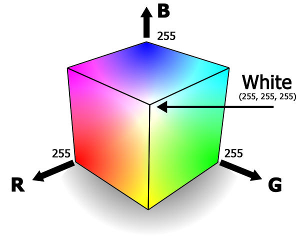
I tried creating a gray candidate, and they performed very poorly with all methods, even though you'd think they'd do well on most methods (being in the middle of color space / ideological space).
On to a bigger issue: are you assuming the candidates are voting entirely naively? For instance, in FPTP, do they simply pick their favorite candidate, rather than factoring in how likely they think it is for each candidate to be a front runner?
-
@rob Hey rob thanks so much for the detailed feedback!
FPTP and Veto seem to produce almost exactly opposite results. [...] I suspect that you are tallying them wrong.
Thanks! You can actually confirm this yourself. You can hover over each voter on the left hand side and it'll tell you their preference scores for each candidate:
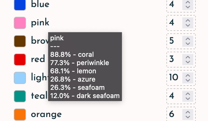
I'll write some unit tests to check if there is a flaw in the calculation, but I think what's most likely happening is that your spoiler candidate ends up making lemon very unlikely to be the most liked and also very unlikely to be the most hated
The same issue applies to VFA (for and against). Candidates that get lots of positive votes seem to also get a similar number of negative votes. That seems unlikely.
Will add tests for this as well.
Regarding colors: I think you should stick with RGB rather than mixing HLS into your distance formular.
I have a solution for this in the works. In the original prototype you are able to switch between RGB and HSL scoring systems. In a future update I'll add this ability back in as it should be pretty simple to do so. I was gonna put it off for a bit, but now that I've some feedback on it I'll prioritize it for the next release
 The only reason I've really been putting it off is because I wanted to make it a bit fancier than just RGB or HSL. Besides the idea of including more complex color spaces, I wanted to let users checkmark which components they wanted (i.e. some weird R+G+B+H hybrid). And yes I'm well aware of how tricky it can be to calculate distance for a component that is cyclic. I spent a lot of time trying to get that right haha
I tried creating a gray candidate, and they performed very poorly with all methods, even though you'd think they'd do well on most methods
The weird color distance formula was actually created specifically to prevent this tbh. The formula ended up weird and if you want a killer candidate try adding "leather" instead of some gray. The reason for this actually has a lot more to do with bias in the data source itself. The color names are taken from the amazing XKCD color survey in which ~140,000 people were prompted random RGB values and asked to name them. XKCD then did some averaging to map color names on to specific points. The colors here are the 954 most popular color names given. It just so happens that people seem to have a lot more names for shades or red/brown colors than most other parts of the RGB color space. I figured if the data source is already biased towards human I might as well use my own human bias in the scoring system to try to concoct something that seems fair to me.
However I agree that the best course of action is to leave this option in the hands of the user
On to a bigger issue: are you assuming the candidates are voting entirely naively?
Yup! This is supposed to be an exploration of the ways to count votes itself and not at all model real life elections. I don't really make any attempts to model voter behavior. But I'll add this to the list of future toggleable options the user can play with
Last note: The XKCD color data is just one data source. The original prototype used a different set of colors that I hand crafted. However, the way that the election calculations work is that each ballot just needs to have an assigned score for each candidate between 0 and 1. This is abstract enough that it should be very trivial to add, for example, different cities in Tennessee voting for which capital to have. This can easily be expanded to more cities than the 4 typically used as examples. The exciting part is that it should also be really simple to add arbitrary custom data as well. So anyone with a set of candidates and a set of ballots (again, ballots are just a mapping of each candidate to 0..1) can model an arbitrary election across all of these different methods. I guess this probably won't really be that useful until I add the ability to toggle more complex voter behavior however though
-
Upon further testing of veto and vfa, I still don't see much unexpected behavior. I think it might just be biases in the selected colors. The default candidates span the color hue pretty decently but this is very much an unlikely (though preferable) scenario to happen in the real world. I'll definitely still write those unit tests, but lemme know if you try it with different sets of candidates/voters and are still convinced there's weirdness
Also if you hover over the bars for a second you'll also see the specific score:
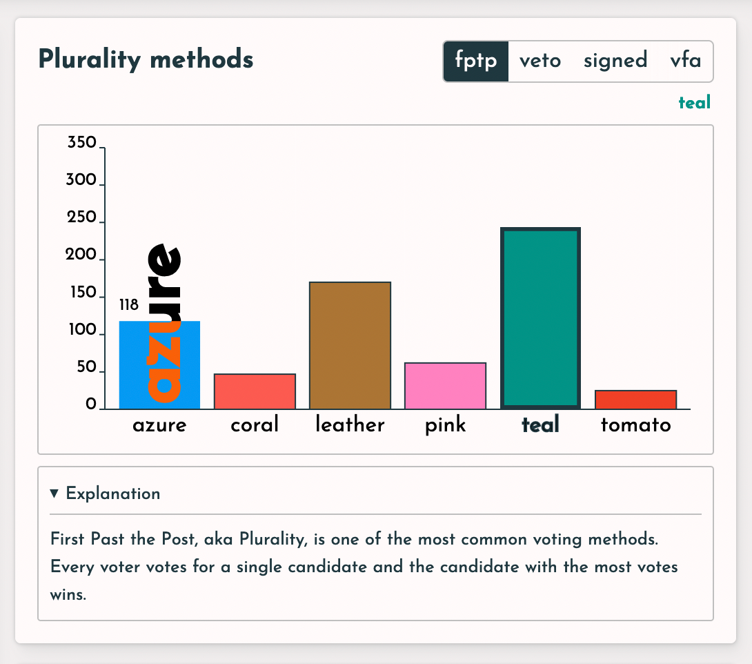
You can use this to quickly check that the fptp score + veto score = vfa score (it does indeed in my quick testing)
-
This is a cool video about computer color blending: https://www.youtube.com/watch?v=LKnqECcg6Gw
I'm not sure if it applies to the problems you're trying to solve with color distance. It's just generally related.
-
@paretoman Thanks for sharing. I think I've actually seen this same video before haha. I have a separate side project where I'm basically trying to recreate Bjorn Ottosson's color picker across multiple colorspaces:
https://bottosson.github.io/misc/colorpicker/
I don't really have anything original to add to this besides support for even more colorspaces. There's also some cool new CSS proposals coming in that will allow us to more easily work with some of these advanced color spaces so I'm eagerly awaiting browser adoption of those haha.
Definitely a space I'm keeping an eye on and have spent a lot of time thinking about. Hopefully that functionality will be integrated into VoteVote soon enough too
-
@paretoman Just rewatched the video. Yup my calculations do already use the geometric mean instead of the euclidean mean haha
-
PS you can preview the upcoming versions here: https://dev--votevote.netlify.app/
This week's been crazy at work so I probably won't be able to implement the color space changes until next weekend, but I have some other exciting updates already in
-
@culi The OKLrCH is interesting. It seems to give the least amount of banding when cycling through hues, at least in my eyes. I would think it would be really good for measuring distance. Well, with one transformation. I would use the hue (H) as a polar angle in cylindrical coordinates and C as the radius. Then convert to cartesian and measure distance. I don't know how I would actually implement this, but it's an idea
... I guess color space is like a double cone with extra pointy parts. I wonder how different this double cone would be from the RGB cube on its diagonal.
-
Regarding the video about how RGB blending is wrong due to gamma... that's true, although I suspect of minor importance in this scenario. But you could certainly do the conversion prior to comparing colors for proximity.
For your purposes, though, the gamma issue is pretty minor importance. If you are doing graphics stuff such as a paint program, much more so. The important thing here is to have it communicate to people who want to mostly think about voting theory, not color theory. (I say this as someone who has spent far more time working with and thinking about color theory than voting theory)
Whether or not you account for gamma, it is still RGB, though, and I think that's rather important. Other systems tend to have degenerate cases, as black white and gray in HSV. Hue is indeterminate for black, for instance, but near blacks would have a hue. So #000001 and #010000 both appear as black on most monitors, but have very different hues meaning they are treated as not-particularly-close colors. The significance of hue should be reduced as the saturation is reduced.... and that is true for RGB systems.
If you want to get even better, you can account for the fact that certain RGB colors (whether or not you've done the above d-gamma-ing) appear lighter than others even if their RGB sum is equal. Pure blue (#0000ff) is much darker-appearing than pure green (#00ff00), at least on monitors. (less so if printed with an ink jet). So you could distort the cube to account for that, like how the Munsell color model is distorted to put yellow at a higher value than blue.
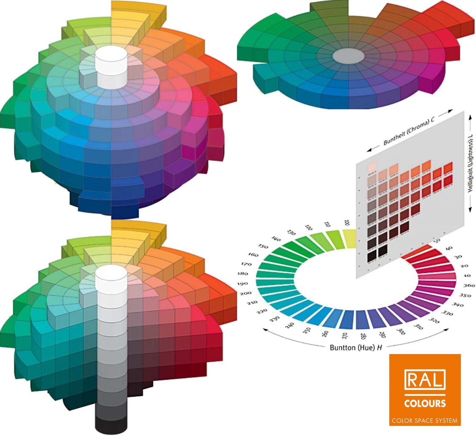
Notice that in Munsell, the physical distance in the color solid is a good indicator of similarity of colors. However, the way Munsell numerically represents the colors (which is HSV, but not the simplified form used in most computer representations), would not be a good way to determine similarity, since it amplifies the importance of hue with low saturation colors.
It's great to allow users to have options, but for the vast majority of the users that don't spend a lot of time thinking about color theory, try to go with what is most intuitive: if colors appear similar, treat them as similar.
You spoke of color names, and that is a different issue. Personally I wouldn't use any names, or stick with simple ones (red, yellow, green etc) rather than expecting people know what is meant by "seafoam". I go to the beach often enough to know what the color of seafoam is, and it ain't that.
Yup! This is supposed to be an exploration of the ways to count votes itself and not at all model real life elections
Sure but strategy is sort of at the heart of all this stuff. You can simplify it, as I did with my simulators, but ignoring it altogether, seems quite misleading to me.
-
@rob The color names are based on XKCD's average from their survey of thousands of people. I'd say the results are, by design, much closer to how people map color names to colors than what some paint company decides
-
@culi Maybe true but I wouldn't rely on names at all, especially if you are using them in ways that go beyond simple visual. (i.e. "distance" between colors)
-
@rob Fair, but I still don't see why it's an issue. You can remove/add whatever candidates and/or voters you'd like. If you want to limit yourself to red/green/blue/other basic colors you totally can!
Anyways all these concerns should be resolved once I have it set up so anyone can add their own custom dataset

-
@culi said in votevote.page is live:
If you want to limit yourself to red/green/blue/other basic colors you totally can!
Gotcha. To be clear, I wasn't suggesting limiting to basic colors like that because that defeats the whole purpose. My suggestion would be pick the colors purely visually from a palette (a small 8x8 palette for 64 colors would be perfect), or using a color picker. If you use a color picker and it shows the RGB values that are used in the proximity calculations (preferably with gamma applied so it is more realistic per the linked video), people will know what 'color proximity' actually means, so I'd consider that a huge plus.
Expecting people to set up a custom dataset is fine, if it's that kind of app. If you want to have something that quickly communicates a concept though, not the approach I'd use.
Obviously it's your app and you can handle it as you want. I actually love the idea of using colorspace to represent ideological space, BTW.
-
@rob said in votevote.page is live:
To be clear, I wasn't suggesting limiting to basic colors like that because that defeats the whole purpose. My suggestion would be pick the colors purely visually from a palette (a small 8x8 palette for 64 colors would be perfect), or using a color picker.
Oh gotchu. Yeah not a bad idea
Expecting people to set up a custom dataset is fine, if it's that kind of app.
Oh no, that's not actually what I meant. What I envision is that the default is to use the current color data. But there's a drop down to use other stuff.
For example, in Wikipedia there's a common example given of cities in Tennessee trying to elect a new capital. Each city's preferences are based on their X,Y coordinates and distance from each other. I could totally add this as a dataset as well (with even more cities probably)
And then at that point I think the logical next step is to make one of the drop down options "custom" where the user can enter arbitrary data. This might also actually make this toy somewhat useful. Like if someone already has votes from a scored election and is wondering how the outcome would've differed under a different scoring method, they can enter that data here simulate it all
But the default would still be color-based unless the user specifically decides they wanna go with something else.
-
Do you have the source code up on Gitlabs or Bitbucket or Github or the like?
-
@jack-waugh At the bottom of all my projects is a "Steal This" button that takes you to the source code. It's up on GitHub:
https://github.com/tif-calin/votevote/
Though I must warn you I haven't yet cleaned it up to make it easy to contribute to (planning on it when I get some free time).
All the logic happens inside this
SuperElectionclass. The main motivation behind this is making a lot of use of cacheing to optimize these calculations. I.e. why calculate the borda score twice for Borda and for STAR when you can just calculate it once and reuse it.So it's quite tangled up right now and not as documented as it should be
-
Moved from Research and Projects by
 SaraWolk